Card
Cards are a flexible and extensible content container. They are commonly used within a page layout or as part of a related group of content.
Installation
Blocks
Client requested dashboard redesign with focus on mobile responsiveness.
- New analytics widgets for daily/weekly metrics
- Simplified navigation menu
- Dark mode support
- Timeline: 6 weeks
- Follow-up meeting scheduled for next Tuesday


Welcome to the Home tab! Here, you can explore the latest updates, news, and highlights. Stay informed about what's happening and never miss out on important announcements.

Lost in the colors of the night 🌌✨ Sometimes the blur reveals more than clarity. #AbstractVibes #Dreamscape #VisualPoetry

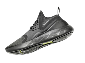
Crossing hardwood comfort with off-court flair. '80s-Inspired construction, bold details and nothin'-but-net style.
Incredible time-saver! shadcn/studio has made UI development a breeze. The pre build components are not only visually appealing but also highly customizable, fitting seamlessly into my projects. With a wide array of options to choose from, I can easily match.
Let's discuss! Our Assistant team is excited to hear about your projects, ideas and questions.

Experience interactive depth and motion with this sleek 3D hover effect. Move your cursor to see it come alive!

